
JOOD Bank
Role
UX/UI Designer (Sole Designer)
Services
Web App Design
Web Design
Branding
Responsive Design
Industry
Finance and Banking
Date
3 Weeks
Tools
Figma
FigJam
Adobe Photoshop
Project Overview
Simplifying Digital Account Opening and Everyday Banking
Summary
JOOD Bank is a responsive online banking platform designed to enable users to easily open and manage personal and business bank accounts without visiting a physical branch. The project focuses on simplifying complex financial workflows and translating them into a clear, accessible digital experience. The objective was to reduce friction in account creation and everyday banking tasks while maintaining trust, clarity, and a professional visual language expected from financial institutions.
The Problem
Traditional banking processes are often time-consuming, paperwork-heavy, and restricted to branch operating hours. Users who prefer digital solutions struggle with unclear onboarding flows, complex financial terminology, and interfaces that feel intimidating rather than supportive.
Users struggle with:
• Lengthy and confusing account opening processes
• Limited access outside business hours
• Poor clarity around financial information
• Lack of confidence when completing digital banking tasks
These challenges create unnecessary friction and discourage users from fully adopting online banking solutions.
Goals & Success Criteria
JOOD Bank was designed to make digital banking feel approachable, efficient, and trustworthy. The goal was not to simplify banking features themselves, but to simplify how users experience and interact with them.
The primary goals were to:
• Enable users to open bank accounts fully online
• Reduce friction during onboarding and verification
• Present financial information clearly and transparently
• Support both personal and business banking needs
• Build trust through calm, professional UI design
Success was measured by users’ ability to complete account setup and core banking tasks without confusion, hesitation, or drop-off.
Research & Insights
To understand user motivations and concerns, I conducted in-depth qualitative research, including 5 interviews with potential bank customers. The research focused on digital literacy, trust expectations, and emotional barriers associated with online financial services.
Key Insights
• Users feel anxious when financial steps are unclear
• Lengthy forms increase abandonment rates
• Transparency builds trust more than visual complexity
• Users value progress visibility during onboarding
These insights directly informed the structure, pacing, and hierarchy of the banking experience.
User Personas
Based on research findings, I created a primary persona representing digitally capable users who value efficiency but require reassurance when dealing with financial products.
This persona helped ensure the design balanced speed, clarity, and trust throughout the experience.
Christina Smith
Christina is a tech-savvy professional who needs to open and manage a bank account quickly without visiting a branch. She is frustrated by long queues, excessive paperwork, and limited banking hours, and expects a digital experience that feels clear, secure, and respectful of her time.

User Flow
To reduce friction and uncertainty, I mapped the core user flow for account creation and basic banking actions. This helped identify unnecessary steps and opportunities to clarify expectations at each stage.
The primary flow focused on:
• Account type selection
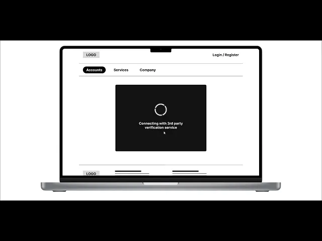
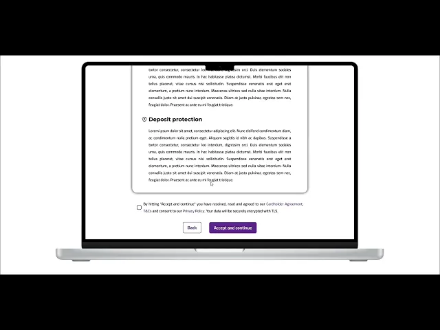
• Digital onboarding and verification
• Dashboard access and account management

Wireframes
Low-fidelity wireframes were created to validate structure, hierarchy, and responsiveness across devices. This phase allowed early testing of content density and form progression.
The wireframes focused on:
• Clear step-by-step onboarding
• Readable financial layouts
• Responsive behavior across screen sizes
• Minimal cognitive load per screen


Visual Design & UI System
After validating the experience structure, I developed a visual system designed to communicate trust, professionalism, and clarity. The UI avoids unnecessary decoration and focuses on calm, consistent presentation.
The design system includes:
• Typography optimized for readability
• A refined color palette that conveys stability
• Consistent buttons and form components
• Clear feedback and confirmation states

Final Design Solution
The final high-fidelity design delivers a clear and approachable online banking experience that supports both first-time onboarding and everyday financial management.
Key Features
• Fully digital account opening flow
• Clean dashboard with clear financial overview
• Transparent transaction and transfer confirmations
• Responsive layouts for desktop, tablet, and mobile


Usability Testing & Iteration
Usability testing was conducted through unmoderated sessions to evaluate clarity, readability, and confidence during key banking actions. Feedback highlighted the importance of visual guidance and confirmation.
Based on testing feedback:
• Typography was adjusted for better readability
• Confirmation steps were strengthened
• Navigation cues were clarified across devices
These refinements improved confidence and reduced friction throughout the experience.

Outcomes & Learnings
Outcomes
• Reduced perceived complexity of digital banking
• Improved onboarding clarity and completion confidence
• Stronger trust signals through visual consistency
Learnings
• Financial UX requires emotional reassurance as much as usability
• Clear progress feedback reduces user anxiety
• Simplicity is essential in trust-based products
This project reinforced the importance of clarity, pacing, and transparency in financial design.
Next Steps
If the project were to continue, future improvements would include:
• Expanded personalization options
• Advanced financial insights and analytics
• Enhanced customer support integration
