
Taskly
Role
UX/UI Designer (Sole Designer)
Services
SaaS Platform
Web App Design
Branding
Industry
Technology
Date
12 Weeks
Tools
Figma
FigJam
Adobe Photoshop
Project Overview
Reducing Cognitive Overload in Task Management
Summary
Taskly is a SaaS task management platform designed to help users manage professional and personal tasks without unnecessary cognitive strain. The project explores how clear information hierarchy, standardized workflows, and intentional UX decisions can reduce mental overload and support efficient collaboration between designers and developers. This project was approached as an end-to-end product design exercise, from user research and problem definition through high-fidelity prototyping and usability validation.
The Problem
Many task management tools aim to be powerful but end up overwhelming users. Instead of supporting focus and productivity, cluttered interfaces, fragmented workflows, and unclear prioritization increase cognitive load and reduce adoption.
Users struggle with:
Prioritizing tasks effectively
Maintaining visibility over progress
Managing complex tasks without feeling overwhelmed
This project focuses on solving these challenges through clarity, structure, and user-centered design.
Goals & Success Criteria
The goals of Taskly were defined to directly address cognitive overload and workflow fragmentation identified during research. Rather than adding features, the focus was on simplifying how tasks are captured, prioritized, and executed.
The primary goals were to:
Reduce cognitive overload when managing tasks
Help users clearly prioritize what matters most
Create a clean and intuitive task management flow
Support consistent design-to-development handoffs
Success was measured by how easily users could understand, prioritize, and complete tasks without confusion or hesitation.
Research & Insights
To understand user needs and frustrations, I conducted qualitative research through interviews and surveys focused on task organization, collaboration, and productivity tools. The goal was to uncover where existing solutions create friction rather than value.
Key Insights
Users feel overwhelmed when too many tasks are visible at once
Lack of prioritization leads to decision fatigue
Fragmented tools disrupt workflow continuity
Users prefer simplicity and clarity over feature density
These insights directly informed all design decisions throughout the project.
User Personas
Based on research findings, I created two primary personas representing the core user groups interacting with Taskly. These personas ensured that design decisions remained grounded in real goals, frustrations, and workflows.
Emily Anderson
A detail-oriented UI/UX designer who needs a standardized way to manage tasks and design handoffs. She is frustrated by fragmented communication and version control issues that slow down her workflow and delay project timelines.
Oliver Thompson
A process-driven lead developer who needs clear, consistent access to design specifications and sprint tasks. He is tired of administrative overhead and resolving discrepancies caused by outdated or missing assets.


User Flow
To ensure a smooth and logical experience, I mapped the core task management flow. This helped identify unnecessary steps and opportunities to simplify interactions.
The primary flow focused on:
Viewing tasks
Prioritizing tasks
Completing tasks efficiently

Wireframes
Low-fidelity wireframes were created to explore layout, hierarchy, and navigation before moving into visual design. This stage allowed for rapid iteration and early usability validation.
The wireframes focused on:
Clear task hierarchy
Minimal distractions
Straightforward navigation


Visual Design & UI System
After validating structure through wireframes, I developed a visual design system to ensure consistency across the platform. The UI emphasizes clarity, readability, and subtle visual emphasis to guide attention without overwhelming users.
The design system includes:
Typography hierarchy
Color palette
Buttons and input components
Task status indicators

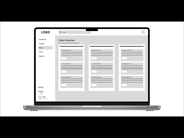
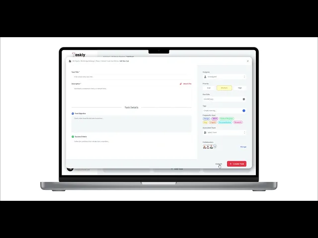
Final Design Solution
The final high-fidelity design delivers a focused task management experience that reduces clutter and highlights priorities. The interface supports quick orientation and minimizes unnecessary visual noise.
Key Features
Dashboard emphasizing task priority and progress
Simple task creation and editing flow
Clear visual indicators for task status
Minimal UI distractions to support focus


Usability Testing & Iteration
Usability testing was conducted using an interactive prototype to evaluate clarity, navigation, and task prioritization. Feedback highlighted areas where users needed stronger visual cues and faster access to key actions.
Based on testing feedback:
Task hierarchy was refined
Visual emphasis on priorities was improved
Interaction details were simplified
These iterations reduced friction and improved overall usability.

Outcomes & Learnings
Outcomes
Improved clarity in task prioritization
Reduced visual clutter across key screens
Design decisions grounded in user insights
Learnings
Simplicity is critical in productivity tools
Early research prevents unnecessary complexity
Iterative testing significantly improves usability
This project reinforced the importance of intentional, clarity-driven design.
Next Steps
If this project were to continue, future improvements would include:
Broader usability testing with a larger user base
Advanced task filtering and customization
Integration with external productivity tools
